

A Better Clinical Trials Experience
Clinical trials are an essential step in the development of new disease treatments and improved medical devices. Thousands of studies are carried out every year around the world, but most clinical trial sponsors struggle to enroll the patients they need.
There are dozens of sites where clinical trials are listed, but largest and most comprehensive database for trial listings is ClinicalTrials.gov. I engaged with a research team to better understand the ClinicalTrials.gov website and uncover areas where the patient experience could be improved.
My role: UX Research, UI Design, Visual Design

The challenge
Many factors make finding a clinical trial unnecessarily difficult and complex for patients. We sought to address the problem through the lens of patients, who often say: “I wish it was easier to find a clinical trial that is right for me.” Currently, patients encounter a poorly designed interface with limited functionality. The site is viewed more as a database for sponsor/research organizations and less as a resource for all parties. The challenge for our team was to improve the user flow for a patient, so they find a clearer path to a clinical trial that meets their requirements.
The research - Uncovering Pain Points
I wanted to begin by understanding what users currently experience when searching on clinicaltrials.gov. I engaged with a small team of consultants to conduct a review of the literature and found that there are a number of article written about the shortfalls of the current ClinicalTrials.gov website.
By conducting a content analysis of the website, we were able to gain a better understanding of the overall information architecture we were dealing with. We compiled the findings from both the online research and our own analysis to determine our laundry list of user pain points.

We were able to focus in on four main areas of concern: The lack of information on the homepage for patients; the technical jargon that makes using the site intimidating; the inconsistent and often confusing search and filter options; and the poor interface for contacting a trial site.
The survey
In order to ensure that we were on the right track, we took our initial findings and conducted a survey to gain in-depth insights about what users experience when using this site. We sought feedback from 15 respondents, some of whom were familiar with the website and others who had never used it.


The research confirmed some of the things we suspected, such as confusion about jargon and research terms and difficulty finding the contact information. And it surprised us to find out that most respondents had less trouble using the filters that we had anticipated. We received helpful qualitative information about what users found either simple or difficult, and straightforward or confusing.
Getting to know the patient
Before diving into the user flow, interfaces, and look and feel considerations, I wanted to clarify who I was designing for. I began by looking at a cross-section of patient populations who can be most benefitted by clinical trials: people like Eva with rare diseases, people at risk for widespread contagious diseases (like Covid-19), and patients in rural areas like Rodney who find accessing care more difficult.

A patient with a rare condition

A rural patient with a chronic condition
User journey
I went back to research and focused on the biggest pain points of the user. After consulting with a few stakeholders, I decided to focus the redesign efforts on the critical path that a patient would follow, beginning with the home page and resulting in finding a clinical trial that meets the search criteria that the patient indicated.

Defining the critical path
We revisited the research to remind ourselves what the biggest user pain points were. The redesign efforts would focus on the patient, whom we confirmed was the least served segment using the site. This critical path begins with the home page and through a series of searches and refinements, results in finding a clinical trial that meets the search criteria that the patient indicated.


The approaches differed in a few ways, including homepage layout, the number of steps involved, the amount of information provided at each step.
What users said
Users overwhelmingly liked the homepage layout of Path 1, but a majority felt that the more condensed approach of Path 2 worked better for the following pages (first search / results / details page / contact)
Wireframes
In order to bring the design to the next step, we wrote some of the critical content of the homepage—the portal where a patient would begin. We refined some of the features on the subsequent screens that we felt would effectively guide the patient from selecting their disease, entering their location, having easy-to-use filters, and then receiving clear information on contacting a trial site.

An improvement for users
Testing the mid-fi mockups with 5 participants resulted in an improved experience. Users were able to complete more of the tasks effectively and had a more positive impression of the interface.


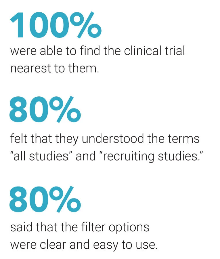
FEEDBACK ON WIREFRAMES
Although users were able to complete the task much more efficiently, they found a number of areas for improvement.
Progress tracking — The current design lacks an indication of which step a users is on. Consider adding a step number to the headlines on each section.
Scannable lists of conditions — It is helpful have the list of most common conditions, especially on mobile when people want to tap vs. type. But they are not immediately visible due to the use of the accordion; perhaps have each condition visible as a clickable element.
Contact page — Placeholder text is missing for the message field, and users may need hint text to determine what type of information would be useful. Also, if the name and ID# of the clinical trial is important, it should be autofilled as part of the reply.
REFINED DESIGNS


What’s next
After showing the design to colleagues who work in the clinical trials field, I received feedback that I’d like to incorporate into the designs. The biggest challenge I currently face is coordination of the design effort and trying to make inroads into governmental bureaucracy. I’ve been encouraged to pursue the redesign effort and make it a reality, but working within the prescriptive CDC process, finding the right collaborative team, and navigating this along side their other redesign efforts will be difficult.