
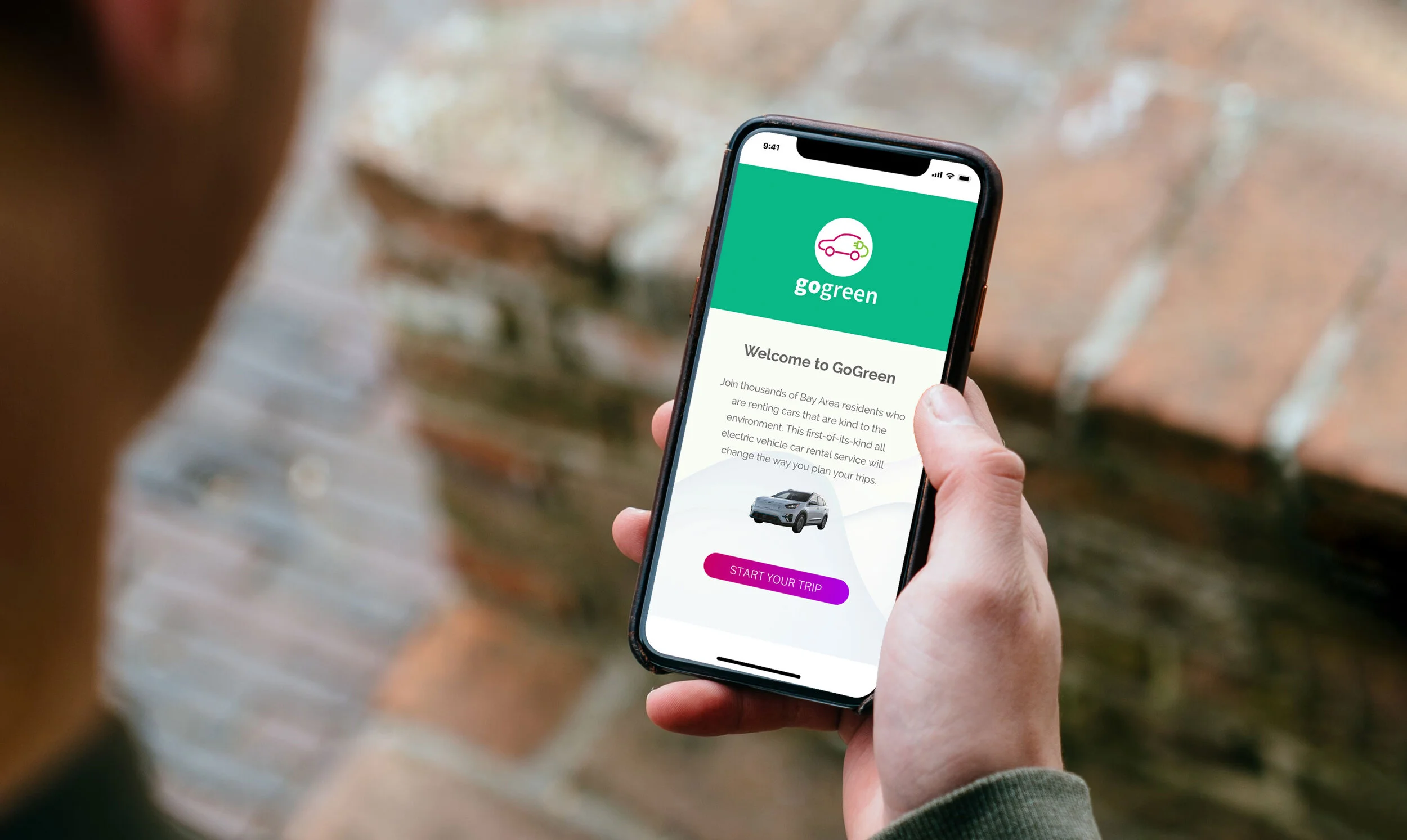
Go Green
Electric vehicles are the future, and double-digit growth of consumer EV sales continues year over year. However, electric vehicles account for just a fraction of a percent of the current car rental fleet in the US.
I worked with a team to better understand customer pain points around renting electric vehicles, what features might make the process more appealing to users, and to gauge interest in all-electric vehicle rentals.
My role: User experience designer

The problem
The problem of greenhouse gas emissions is one that plagues our planet. The use of electric vehicles (EVs) can significantly reduce emissions, and car rentals are one way we can put more EVs on the streets. Currently, less than 1% of all rental vehicles available to the public are EVs. Given that the demand for such rentals will only increase, we need to address the hurdles that make widespread EV rentals a reality.


The goal
• Research consumer sentiment about electric vehicles
• Investigate ways to incorporate charging station information into the rental process
• Launch a prototype of an all-EV car rental service
The research
To understand the current car rental landscape and the mindset of potential EV rental consumers, I led an effort to conduct online research and interviewed three current rental customers. The team and I wanted to gain insights about their experiences with car rentals in general and also about the possibility of an electric vehicle rental. We conducted a rose-bud-thorn exercise and a card sorting exercise with two of the customers.


In order to corroborate some of the initial findings, we interviewed three people familiar with renting cars, using rental apps, and having some knowledge of EVs. During the 60-minute sessions, we delved deeper into the many issues surrounding electric vehicles.


Three issues emerged from my conversations with users. First, there is a scarcity of EV rentals in the market today. Second, users want the same flexibility for an EV rental as they can have with other rental services like ZipCar and Getaround. Third, dealing with finding a recharging station and concerns about the range of an EV were problems voiced by all participants.
Competitive Analysis
To gain a better perspective on the industry, we performed a competitive analysis of the major players in the eco-friendly rental space. We found that none of the companies fit all the criteria we were searching: being all or mostly electric, being open to the general public, offering trip planning as part of the rental app, and targeting the longer-term rental market (versus short errand-style trips).


The User Journey and Personas
Because recharging came up frequently, our team decided to focus our research and design efforts on that portion of the car booking process.

Before getting into specifics about interfaces, design specifications, or business goals, we wanted to clarify who we were designing for. To get a better sense of how this service would fit into the lives of the users, we created two personas based on targeted segments for car rentals. Frequent Flyer John doesn’t own a car, travels often for work, and rents frequently, and Busy Mom Alice travels regularly and would like more rental options. After reviewing the research and consulting with team members, we found that two themes emerged: Making booking as simple as possible and making it easy for users to see nearby charging stations.


Initial sketches with two user paths
We took a holistic approach to creating an overall structure of the experience, tapping into best practices and features from other apps. We each sketched the basic UI elements and assumed user interactions. After a few rounds of sketches, our vision started to take shape. We consolidated our efforts to create two design options: Path A: Big Picture and Path B: Expedited Experience.

At this stage in the process, we gathered feedback on how a consumer would interact with the prototype and user flow: In-person testing with three users using paper prototypes. We asked users to choose a starting location from either a map or typing in an address, choose the ending location, confirm the selections, then review a summary of their trip and a car recommendation.

What we learned from testing
Overall, users gravitated toward Path B as the more intuitive and desirable option. Based on the feedback received, we made the range calculator an automatic part of the rental confirmation process. We reduced the number of clicks needed to start the booking process, and we streamlined the confirmation page. To improve users’ ability to find important information, we added an information symbol in places where definition of terms or clarification might be required.
Wireframes
We incorporated the feedback that I gathered from my user testing session. I was charged with the first round of creating wireframes in Sketch to more fully flesh out the user interaction requirements for each step in the process.

Home screen

Home screen “Range of EV”

Let’s get started

Confirm locations

Trip details

Charging station locator
UI Design
In order to ensure we were on the right track, we conducted an informal user test of the booking flow using the more detailed wireframes. Concurrently, I led the effort to create a design system that I was able to leverage for map views, interactions, and notifications.
We wanted to make sure users could quickly access to primary functions. The icons were made large enough to enable easy tapping, leveraging users’ prior experience with Google Maps and existing iOS designs to make learning to use the app as intuitive as possible.
The home screen and the Path B user flow for booking an EV rental and seeing the charging station locations began to take shape. Below are instances where we introduced a new idea or design to solve a user pain point that was uncovered in the research and testing phases. These revolved mostly around integrating existing functionality (like charging station locations) into a rental app. Because of time constraints and not everyone on the team being able to contribute as much as they would have liked, we reduced the number of screen designs to only the most important in the user flow.


The impact
The GoGreen app has received both positive and negative feedback since its development. Users have responded well to the app's features and the intuitive design. Some negative feedback includes the lack of research on the feasibility of launching this type of service, in terms of the the real-world experiences of recharging an EV while on the road versus at home. Also, the viability of the business model was questioned, which was outside the scope of this conceptual project.
In order to make this vision a reality, we need a full product team dedicated to developing and testing all the functionality. There is still great potential in the idea, and I’d be interested in taking the insights gained from this round of design to inform Round 2.